一般来说,数据分析分为统计检验和可视化两个部分。
今天给大家分享一个R包,可将这两个部分合二为一,不仅能够画出美观精致的图表,还能够同时展现统计分析的详细结果,简直“一石二鸟”、“一举两得”!这个包为ggstatsplot,非常适合做统计分析的科研工作者们,赶紧用起来!

#所需R包的安装和载入
remotes::install_github( "IndrajeetPatil/ggstatsplot")
library( "ggstatsplot")
library( "ggplot2")
#关于载入报错:如果library时报错datawizard这个包版本不对,则需从github上安装最新开发版;未报错可忽略
remotes::install_github( "easystats/datawizard")
#生成随机数种子,让结果具有重复性
set.seed(123)
#使用R内置的鸢尾数据集和葡萄酒测试数据集来进行本次绘图
dt<-iris
library(WRS2) #data
dt2<- WineTasting
head(dt)
head(dt2)
(dt)
(dt2)
1. 绘制组间比较的小提琴箱线图
#ggbetweenstats,用于绘制组间比较的箱线图、小提琴图及小提琴箱线组合图,并提供详细的参数检验和统计信息
p1<- ggbetweenstats(
data= dt,
x= Species,
y= Sepal.Length,
plot.type = "box",#图标类型,不加参数则默认为boxviolin,其它可选为:box、violin
title= "Distribution of sepal length across Iris species"
)
p1#上述为ggbetweenstats的最简单函数调用
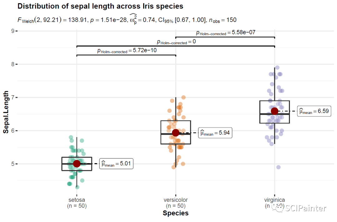
通过箱线图及统计检验数据,我们可以清楚的看出三个不同种鸢尾的萼片长度两两间都是有显著性差异的。
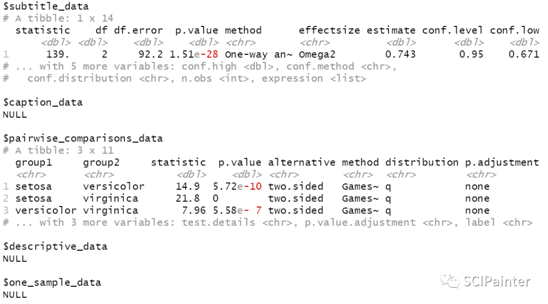
#提取统计数据
ggbetweenstats(iris, Species, Sepal.Length) %>%
extract_stats
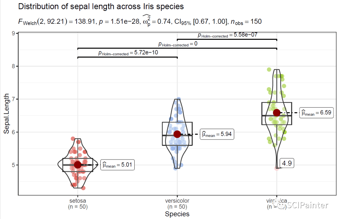
#部分可视化有关的参数:
p2<- ggbetweenstats(
data= dt,
x= Species,
y= Sepal.Length,
plot.type = "boxviolin",
title= "Distribution of sepal length across Iris species",
results.subtitle = TRUE,#决定是否将统计检验的结果显示为副标题(默认TRUE);如果设置为FALSE,则仅返回绘图
subtitle= NULL,#副标题,默认显示统计检验结果,自定义则results.subtitle=FALSE
outlier.tagging = TRUE,#是否标记离群异常值,默认FALSE
outlier.shape = 19,#异常值形状,可设置为NA将其隐藏(不是删除,因此不会影响统计检验结果)
outlier.color = "pink",#异常值颜色
outlier.label.args = list(size = 4),#异常值标签大小
point.args = list(position = ggplot2::position_jitterdodge(dodge.width = 0.6),
alpha= 0.5, size = 3, stroke = 0),#传递给geom_point的参数设置
violin.args = list(width = 0.4, alpha = 0.2),#传递给geom_violin的参数设置
ggtheme= theme_bw,#主题修改,可直接调用ggplot2的主题,默认主题为ggstatsplot::theme_ggstatsplot
package= "ggsci",#提取调色板所需的包
palette= "uniform_startrek"#选择提取包中的调色板
)
p2
↓↓以下为部分跟统计检验有关参数说明(更详细说明需自行查阅帮助文档):
type = "parametric" #指定统计方法:可选parametric(默认参数检验:2组为t-test,3组及以上为anova)、noparametric(非参检验)、robust(稳健性检验)、bayes(贝叶斯检验)
pairwise.comparisons = TRUE#决定是否成对比较,默认TRUE,一般只显示有显著性差异的
pairwise.display ="significant" #展示显著或不显著,可选significant(s)、non-significant(ns)、all
p.adjust.method = "holm" #多重检验p值调整的方法,可选"holm"(默认)、"hochberg"、 "hommel"、"bonferroni"、"BH"、"BY"、"fdr"、"none"
bf.prior = 0.707#0.5—2(默认0.707)间的数字,用于计算贝叶斯因子的先验宽度
bf.message =TRUE#决定是否显示贝叶斯因子以支持零假设逻辑,默认TRUE
k =2L #到小数点后的位数
conf.level =0.95#可选区间为0-1,默认返回95%置信区间
centrality.plotting = TRUE#决定是否将中心性趋势度量显示为带有标签的点的逻辑,默认TRUE
centrality.type =type#决定要显示哪个中心性参数,默认和type一致,可选项参照type
2. 绘制组内比较的小提琴箱线图
#ggwithinstats用于绘制组内比较的小提琴箱线组合图
#此函数为ggbetweenstats的孪生函数,行为方式也基本相同。绘图结构之间区别在于在组与组均值之间通过路径连接来突出数据间彼此配对
install.packages( "afex")
library(afex) #to run anova
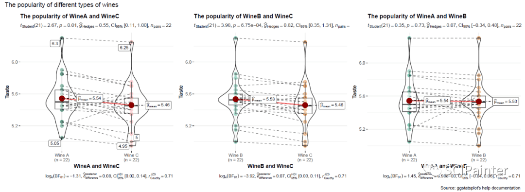
p3<- ggwithinstats(
data= dt2,
x= Wine,
y= Taste,
title= "The popularity of different types of wines",
type= "p", ## parametric
pairwise.display = "significant"
)
p3
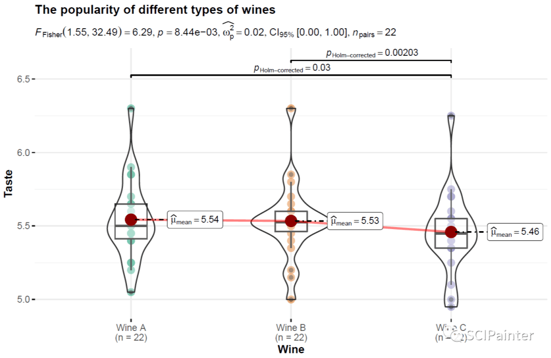
在这个数据集中,共有22位测试者分别品尝了A、B、C这三种类型的葡萄酒,并按喜好打分;结果显示Wine A、B分别与C都有显著性差异,且C的得分最低,因而说明了在三种葡萄酒中,Wine C是最不受欢迎的。
#把WineA、B和C分别进行两两比较,并拼合为一张图
dt3<- dplyr::filter(dt2, Wine != "Wine B")#在数据中去掉Wine B
dt4<- dplyr::filter(dt2, Wine != "Wine A")#在数据中去掉Wine A
dt5<- dplyr::filter(dt2, Wine != "Wine C")#在数据中去掉Wine C
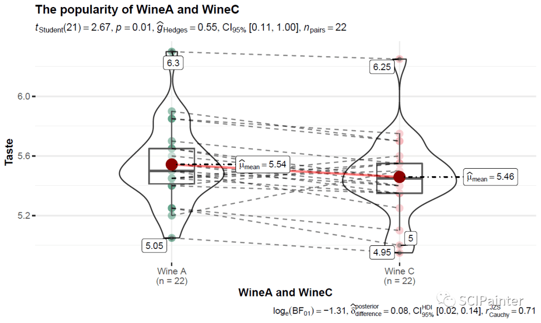
p4<- ggwithinstats(
data= dt3,
x= Wine,
y= Taste,
xlab= "WineA and WineC",
ylab= "Taste",
title= "The popularity of WineA and WineC",
type= "p", ## parametric
outlier.tagging = TRUE ,##显示离群值
pairwise.display = "significant",
package= "yarrr",
palette= "info2"
)
p4
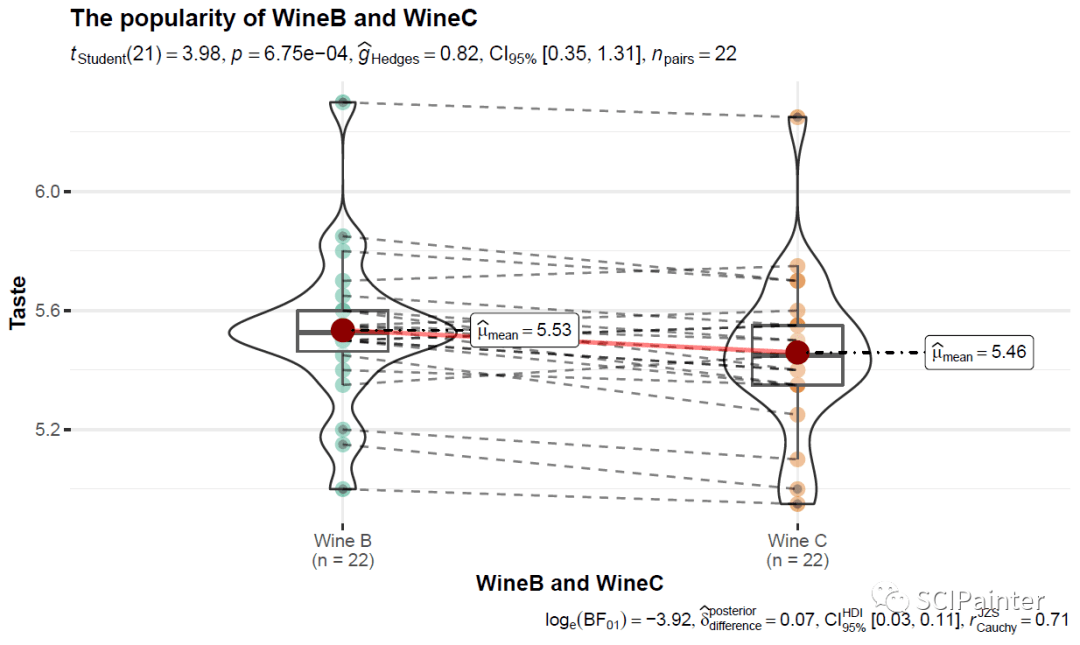
p5<- ggwithinstats(
data= dt4,
x= Wine,
y= Taste,
xlab= "WineB and WineC",
ylab= "Taste",
title= "The popularity of WineB and WineC",
type= "p", # parametric
outlier.tagging = FALSE ,#不显示离群值
pairwise.display = "significant"
)
p5
p6<- ggwithinstats(
data= dt5,
x= Wine,
y= Taste,
xlab= "WineA and WineB",
ylab= "Taste",
title= "The popularity of WineA and WineB",
type= "p", # parametric
outlier.tagging = FALSE ,#不显示离群值
pairwise.display = "significant"
)
p6

(A、B间无显著性差异)
#合并p4、p5、p6:
combine_plots(
list(p4, p5, p6),
plotgrid.args = list(nrow = 1),
annotation.args = list(
title= "The popularity of different types of wines",
caption= "Source: ggstatsplot's help documentation"
)
)
那么今天的分享就到这里,欢迎转发分享到朋友圈~
更多信息:
ggstatsplot说明文档:
https://indrajeetpatil.github.io/ggstatsplot/
关于所有假设检验及统计相关说明:
https://indrajeetpatil.github.io/statsExpressions/articles/stats_details.html
转自 SCIPainter